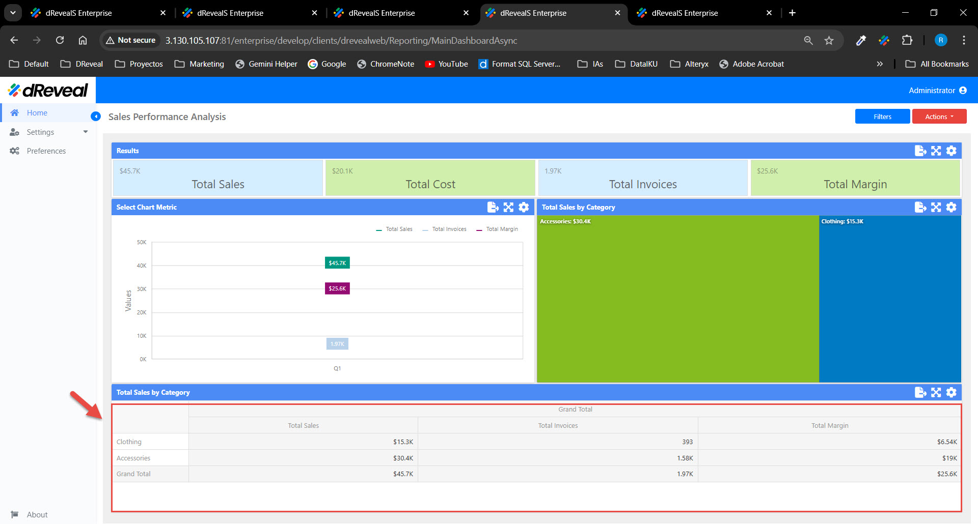
Pivot Chart
A Pivot chart is a dynamic visualization that allows users to reorganize, summarize, and analyze large volumes of data interactively, using a pivot table structure. This type of chart is useful when exploring relationships between different variables and facilitating the analysis of complex data. Pivot charts allow data to be displayed flexibly, enabling users to select different dimensions and measures to represent relationships visually. Additionally, you can customize various aspects of the Pivot chart to suit your needs and enhance data visualization. These configurations can be found in the Menu option. The following sections will detail these options:
LAYOUT
The options vary depending on the type of chart. In the Pivot chart, the user has the following option. The user has the following option in the "LAYOUT" section.
| Options | Values | Description |
|---|---|---|
| LAYOUT | Compact/Tabular | This option allows the user to display values from different row dimensions. It offers two choices: Compact - Shows values from various Row dimensions within one column. Note that totals are displayed at the top of a group in this layout, and you cannot adjust their position. Tabular - Displays values from different Row dimensions in distinct columns. |
| COLUMN TOTALS | ON/OFF | This option allows the user to enable or disable the visibility of Pivot column totals calculated. |
| ROW TOTALS | ON/OFF | This option allows the user to enable or disable the visibility of Pivot row totals calculated. |
| COLUMN GRAND TOTALS | ON/OFF | This option allows the user to enable or disable the visibility of Pivot column grand totals calculated across all columns. |
| ROW GRAND TOTALS | ON/OFF | This option allows the user to enable or disable the visibility of Pivot row grand totals calculated across all rows. |
| COLUMN TOTALS POSITION | Far/Near | This option allows the user to define the position of column totals/grand totals in the Pivot dashboard item with the options Far or Near. |
| ROW TOTALS POSITION | Bottom/Top | This option allows the user to define the position of row totals/grand totals in the Pivot dashboard item with the options Bottom or Top. |
| VALUES POSITION | Columns/Rows | This option allows the user to control the position of the headers used to organize the summary values corresponding to different measures. The values can be displayed in columns or rows: Columns - Headers for summary values appear in columns. Rows - Headers for summary values appear in rows. |
INITIAL STATE
The options vary depending on the type of chart. In the Pivot chart, the user has the following option. The user has the following option in the "INITIAL STATE" section.
| Options | Values | Description |
|---|---|---|
| AUTO-EXPAND COLUMN GROUPS | YES/NO | This option allows the user to collapse or expand column groups by default. |
| AUTO-EXPAND ROW GROUPS | YES/NO | This option allows the user to collapse or expand row groups by default. |
How to Apply the Settings of the 'Menu' Option
To apply the settings in a chart, first enter your username and password, then click the Login button. Once logged in, navigate to the report you want to run and double-click it to open. Next, click the Apply button to display the report. Once the report is loaded, click on the Menu option located at the top right of the chart; the icon is a gear. The available options for configuring the chart will then be displayed.
Pivot Chart

