Item
Dashboard Designer allows the user to perform actions such as Duplicate, Delete, Remove Data Items, and Transpose. With these actions, users can precisely tailor their reports to their needs.

Duplicate
Duplicating a chart is an essential practice to streamline reporting. By duplicating an existing chart, users can quickly customize its appearance and adapt it to different contexts, saving time and effort. This functionality encourages visual reuse, reporting consistency, and cross-team collaboration, allowing users to focus on what really matters: extracting valuable insights from data.
How to Duplicate a chart
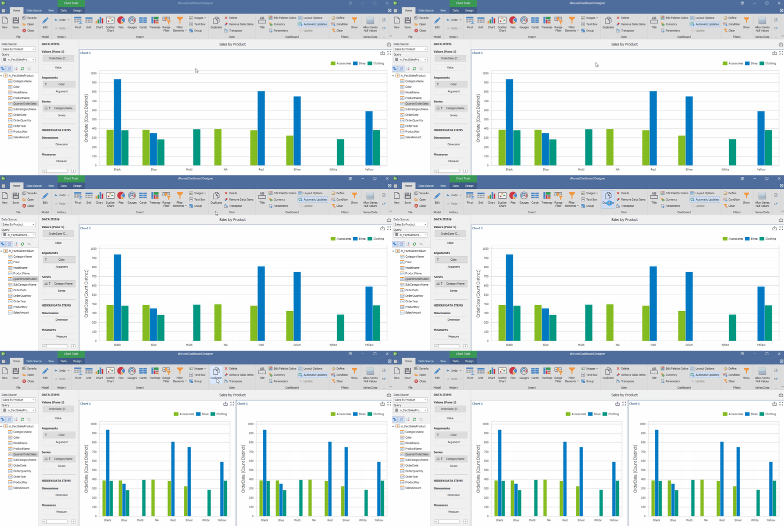
To create multiple visualizations quickly and efficiently in the Panel Designer, simply open the report where you want to duplicate the graphic. Once inside, select the graphic and click the "Duplicate" button. This action will create an exact copy of the graphic, allowing you to customize it to your needs without having to start from scratch. Save time and effort with this practical feature!.

Delete
Delete a chart is essential for optimizing reports. By eliminating unnecessary visual elements, clarity is improved, data comprehension is facilitated, and a more professional and concise design is created.
How to Delete a chart
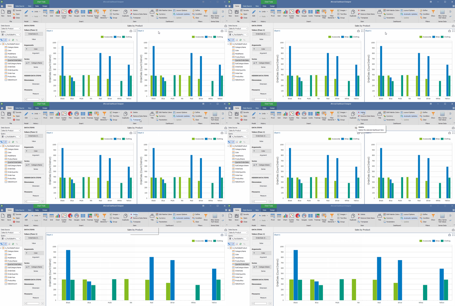
Want to customize your reports and remove distracting elements? To delete a chart in the Panel Designer, simply open the report, select the chart you want to remove, and click the delete icon. This action will allow you to create cleaner, more professional designs, focusing on the data that truly matters.

Remove Data Items
Removing specific data items is a crucial tool for maintaining the cleanliness and accuracy of graphs. By eliminating erroneous, duplicate, or irrelevant data, the quality of the visualization is significantly improved, preventing misinterpretations and facilitating data-driven decision-making.
How to Remove Data Items in a chart
Making informed decisions relies on accurate data. To ensure this, you can remove data elements that might distort your analysis. In the Panel Designer, open the report, select the chart, and click "Remove data items". This action will provide you with clearer, more concise graphs, making it easier to identify patterns and trends relevant to your decision-making.

Transpose
Transposing values provides great flexibility to adapt graphs to specific analysis needs. By swapping the 'Arguments' and 'Series' or 'X' and 'Y' axes, you can gain a new perspective on the data, allowing you to visualize relationships between variables in different ways and making it easier to identify patterns and trends that might otherwise be overlooked.
How to Transpose values in a chart
To gain a more comprehensive perspective of your data, you can transpose the values in your chart. In the Panel Designer, select the chart and click the 'Transpose' button. This simple action allows you to switch the orientation of the data, giving you greater flexibility in your analysis.

