Grid Chart
Dashboard Designer provides users with the ability to design Grid-type charts, allowing for a clear and effective representation of data.
Steps to Create a Grid Chart:
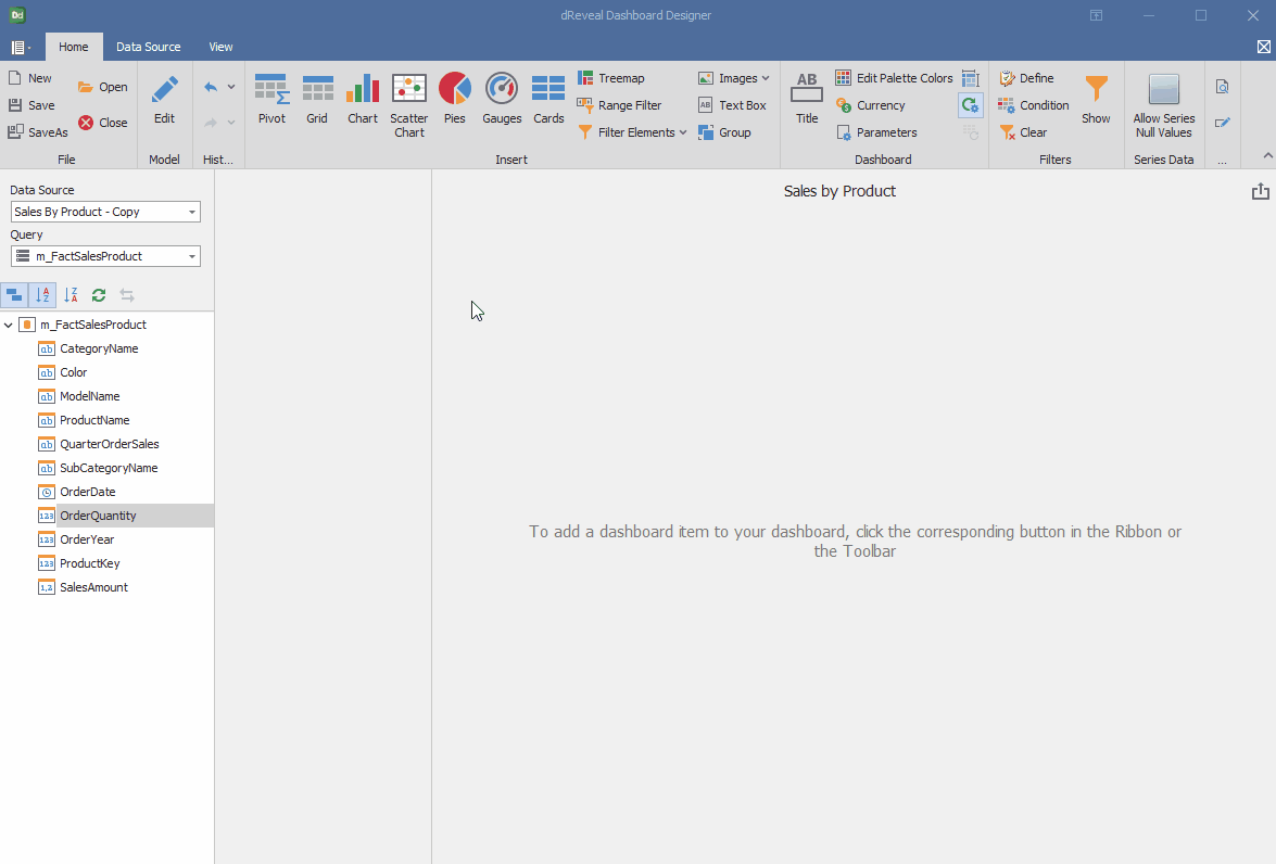
- Open Dashboard Designer.
- Create a new report or open an existing one.
- Click on the "Grid" icon.
- Drag and drop the columns from the main view to the "Columns" section of DATA ITEMS.
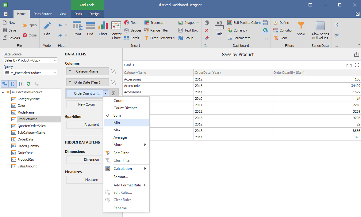
- Apply the desired format to the number column.
Dashboard Designer also provides various options to customize the 'Grid Chart' based on the data type displayed in each column. Below is a general overview of the different options you can apply to your Grid Chart.
Column of type String:
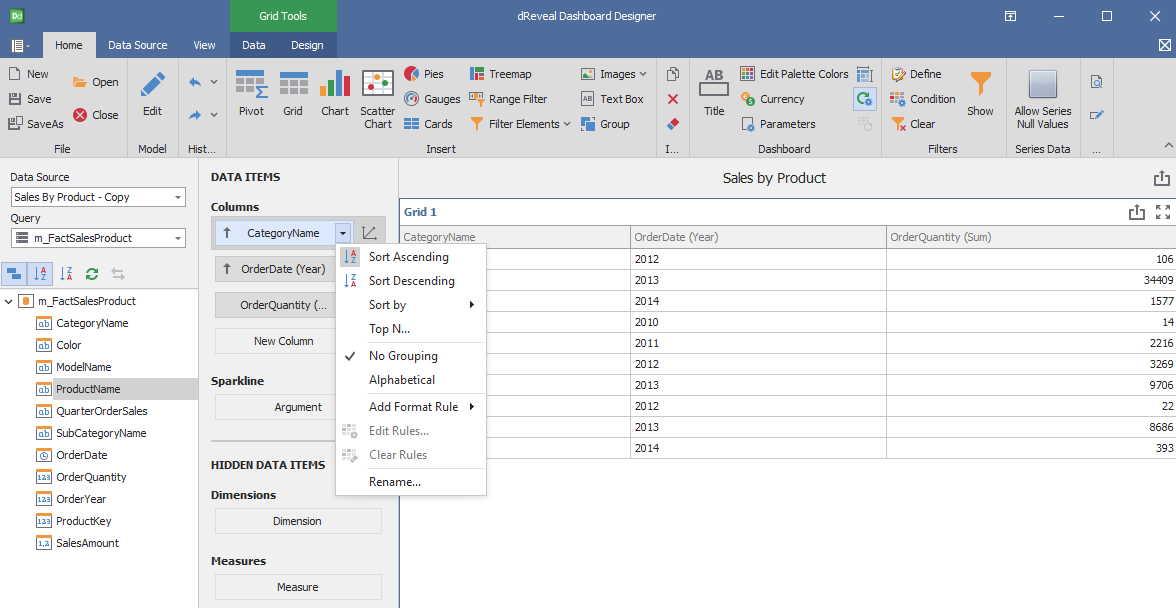
Column of type Date:
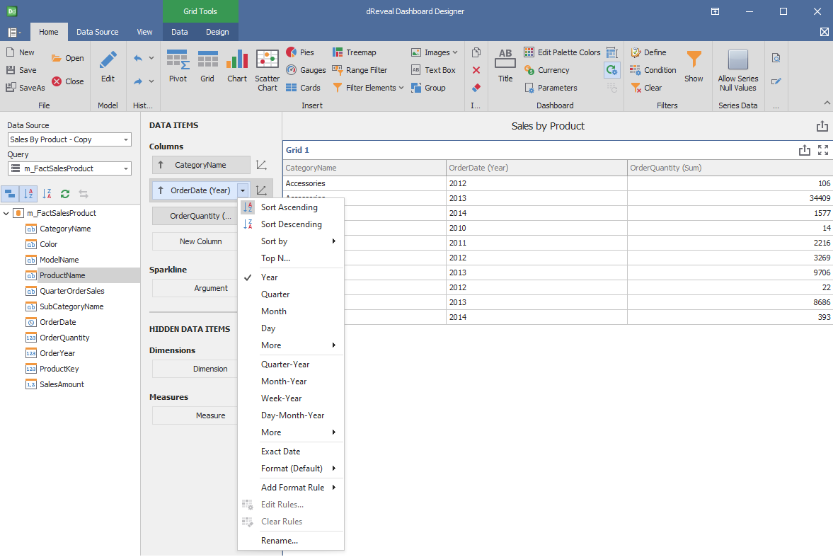
Column of type Numeric:
Design
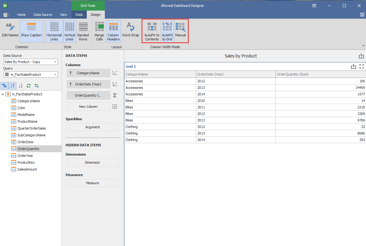
'Grid Chart' has a variety of options in the 'Design' tab to customize your chart. Next, we will show you the different options you can apply to your Grid chart.
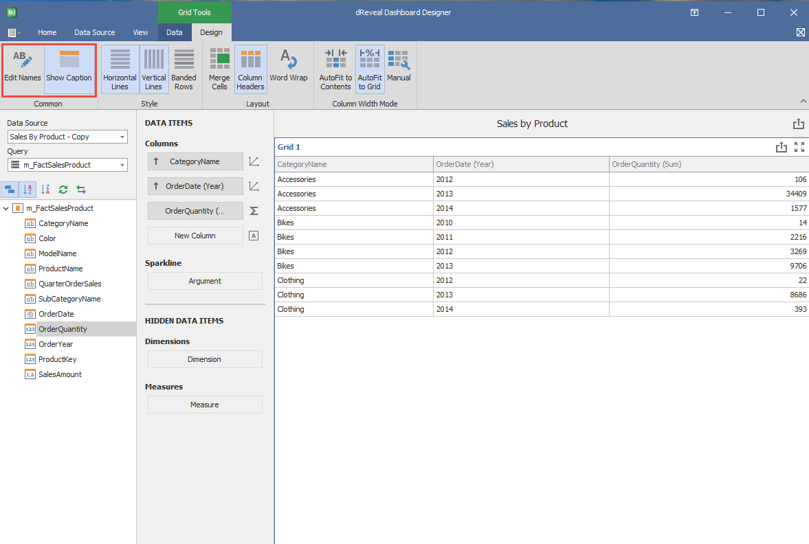
Common
| Options | Description |
|---|---|
| Edit Names | Edit the name of the chart. |
| Show Caption | Show the dashboard item's caption. |
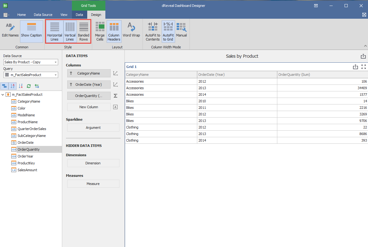
Style
| Options | Description |
|---|---|
| Horizontal Lines | Show horizontal grid lines. |
| Vertical Lines | Show vertical grid lines. |
| Banded Rows | Paint the background of even and odd rows differently to make the grid easier to read. |
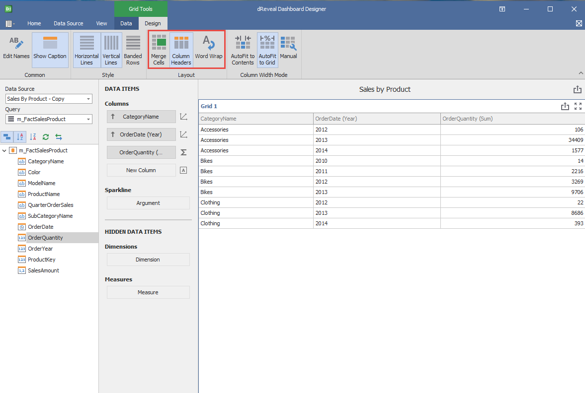
Layout
| Options | Description |
|---|---|
| Merge Cells | Merge adjacent cells with identical data. |
| Column Headers | Show column headers. |
| Word Wrap | Enable word wrapping that allows displaying cell content on multiple lines. |
Column Width Mode
| Options | Description |
|---|---|
| AutoFit to Contents | Adjust the width of columns automatically to display their content entirely. If the grid cannot display the entire content, horizontal scrolling is enabled. |
| AutoFit to Grid | Adjust the width of columns automatically to display their content in an optimal way depending on grid width. |
| Manual | Adjust the width of columns manually. |